How to start using the new beautiful card layouts for listings
Alejandro Schmeichler
We recently released JReviews 3.6. In this version we've put a lot of work into improving the overall user interface. There are important UI changes throughout, including form elements, dialogs, and a new improved listing comparison widget that also works on mobile. The most notable improvement, though, are the new card-based layouts for the listing list pages, listings module, related listings widgets and listings shortcode. These new layouts are stunning, fully responsive so they display great on desktop and mobile, and they will immediately transform your site so it looks better than ever.
When dealing with user generated content and not having complete control over the entire page layout, it is a real challenge to create fully adaptive layouts that work under many different scenarios. Using CSS' grid layout, inspiration from the Tailwind CSS framework, and Adam Wathan and Steve Schoger's work, we were able to put together these wonderful new layouts for JReviews that will work quite well under most scenarios.
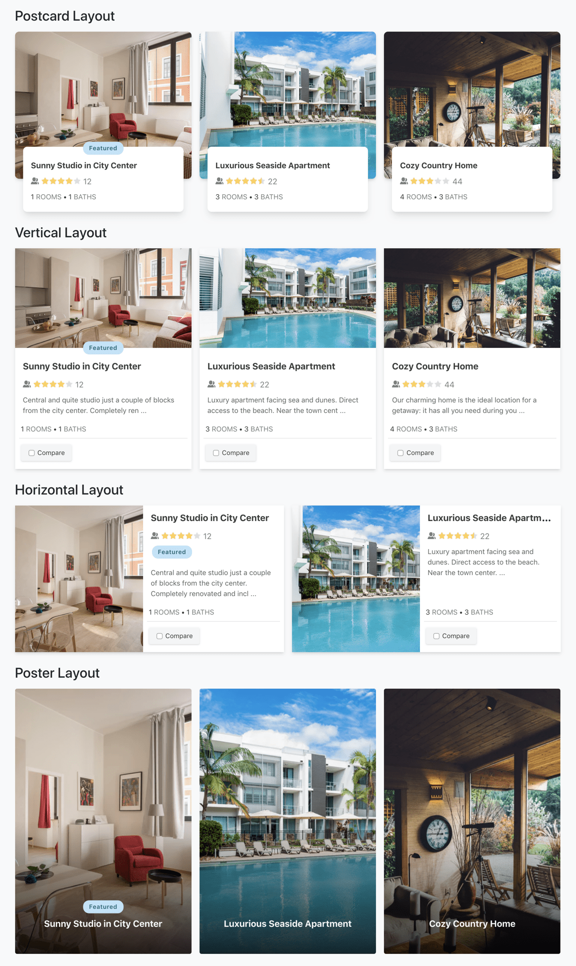
Four new stunning card layouts
In addition to the four existing layouts blogview, tableview, thumbview, and masonry, there are are four new card-based layouts: horizontal card, vertical card, postcard and poster layouts. You can see examples of all of these below. We also implemented a masonry option for the vertical layout, bringing the total number of default list page layouts to nine.

Selecting the new layouts
There's a new section in the JReviews administration sidebar called 'Layout Customizer'. Here you'll find links for the 'Listings List' and 'Listings Module' (Joomla) / 'Listings Widget' ( WordPress). In each of these pages you can see the default layouts and make copies of them to customize their settings.
Using the card layouts in listing list pages
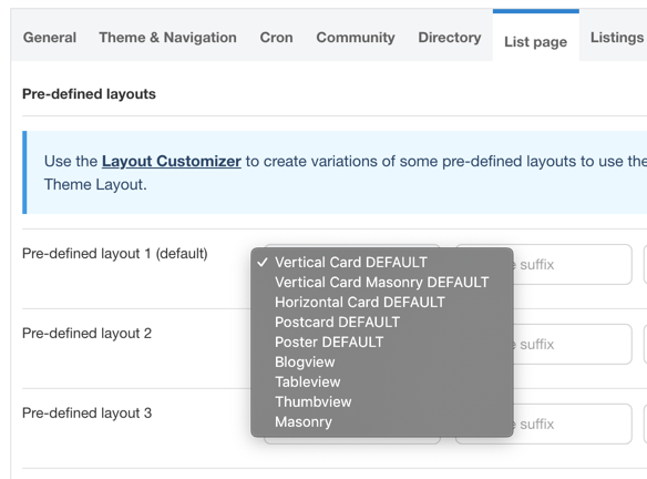
To use the card layouts in list pages, you'll be able to select them in JReviews Configuration / List Page / Pre-defined layouts as shown in the image below.

In addition to the pre-defined layouts setting, you can assign the Listing List layouts in many other places in JReviews. Below is a list of different areas where you can select the layouts:
- Configuration Settings / List Page / Pre-defined layouts
- Configuration Settings / Search / Theme Layout
- Category Layout Manager
- List Page Menus
Using the card layouts in listing modules/widgets
To use the card layouts in the listings module in Joomla and listings widget in WordPress, you need to update the module/widget and find the new Theme Layout setting where you'll be able to select one of the layouts form the list.
The module/widget layouts can also be used in the Listing Type Related Listings Widgets and Shortcodes. For the related listing widgets, you'll also find a Theme Layout setting. While for shortcodes, you will need to get the layout ID from the customizer list and use the `themelayout` attribute in your shortcodes as shown below.
[jreviews type="listings" category="22" themelayout="vertical"]
To learn more read the ShortCodes Documentation.
Many possibilities with the Layout Customizer
We wanted to make it possible for you to make the most from these beautiful layouts. To do that, we came up with the idea of the Layout Customizer to allow you to create copies and different variations of the default layouts without having to make any code changes. Of course you can still create copies of the layout theme files using theme suffixes and take your customizations to the next level.
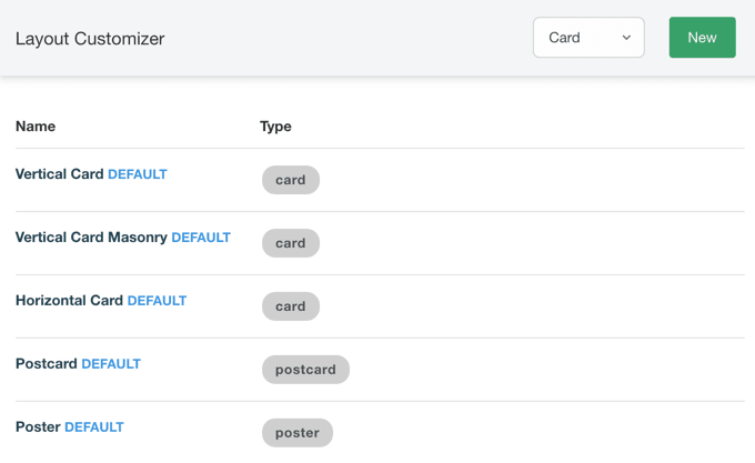
Below you can see the Layout Customizer, which starts off with the default card layouts:

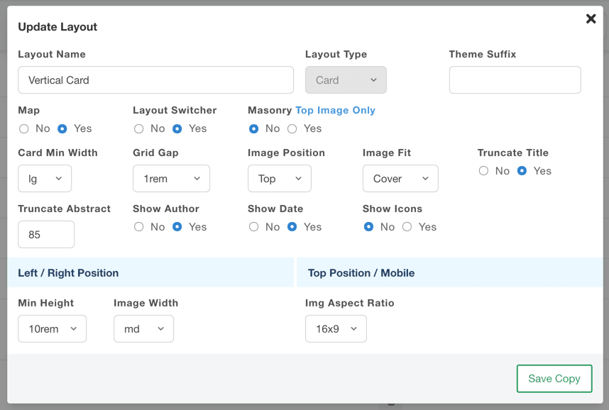
You can then make a copy of the existing layouts and modify any of the many settings available at this time.

Any new layouts you create will automatically made available for selection in the different areas mentioned above.
Optimizing card dimensions
In the Layout Customizer you are able to modify multiple card settings, like the minimum card width which will adjust automatically at different breakpoints to make them responsive. In other words, by modifying the minimum card layout width, you also have some control over the the number of cards per row, or columns, that is used at different screen sizes. You can also modify the image aspect ratio which is retained at different breakpoints.
The dimensions for the card, card image and some of the text inside the card are relative, and based on the page's root font size assigned to the html tag. The default browser font-size is 16px and that's what the default cards are optimized for. Many sites are using older versions of Bootstrap which sets this font-size to 10px. If you are seeing a very small font-size on the cards, we recommend overriding it to 16px so you can use the default cards without having to make any changes to them. You can easily do this with CSS added to your Joomla template or WordPress theme's custom CSS file or setting.
html {
   font-size: 16px;
}
Banners in card layouts
The card layouts have several positions that you can use to add banners through the use of Joomla modules and WordPress widgets. The following positions can be used in Joomla, by typing the position in the module setting and pressing enter. In WordPress, you will find the new positions listed in Widgets mananger:
- jr-listings-card-position-1
- jr-listings-card-position-2
- jr-listings-card-position-3
- jr-listings-card-position-4
- jr-listings-card-position-last
To learn more read banner positions in JReviews.
We hope you enjoy this update and the new card layouts!
This blog post has been updated to reflect the roll-out of the new card layout designs for Joomla modules, WordPress widgets, related listig widgets and shortcodes. As well as the new banner positions available for cards in listing list pages.